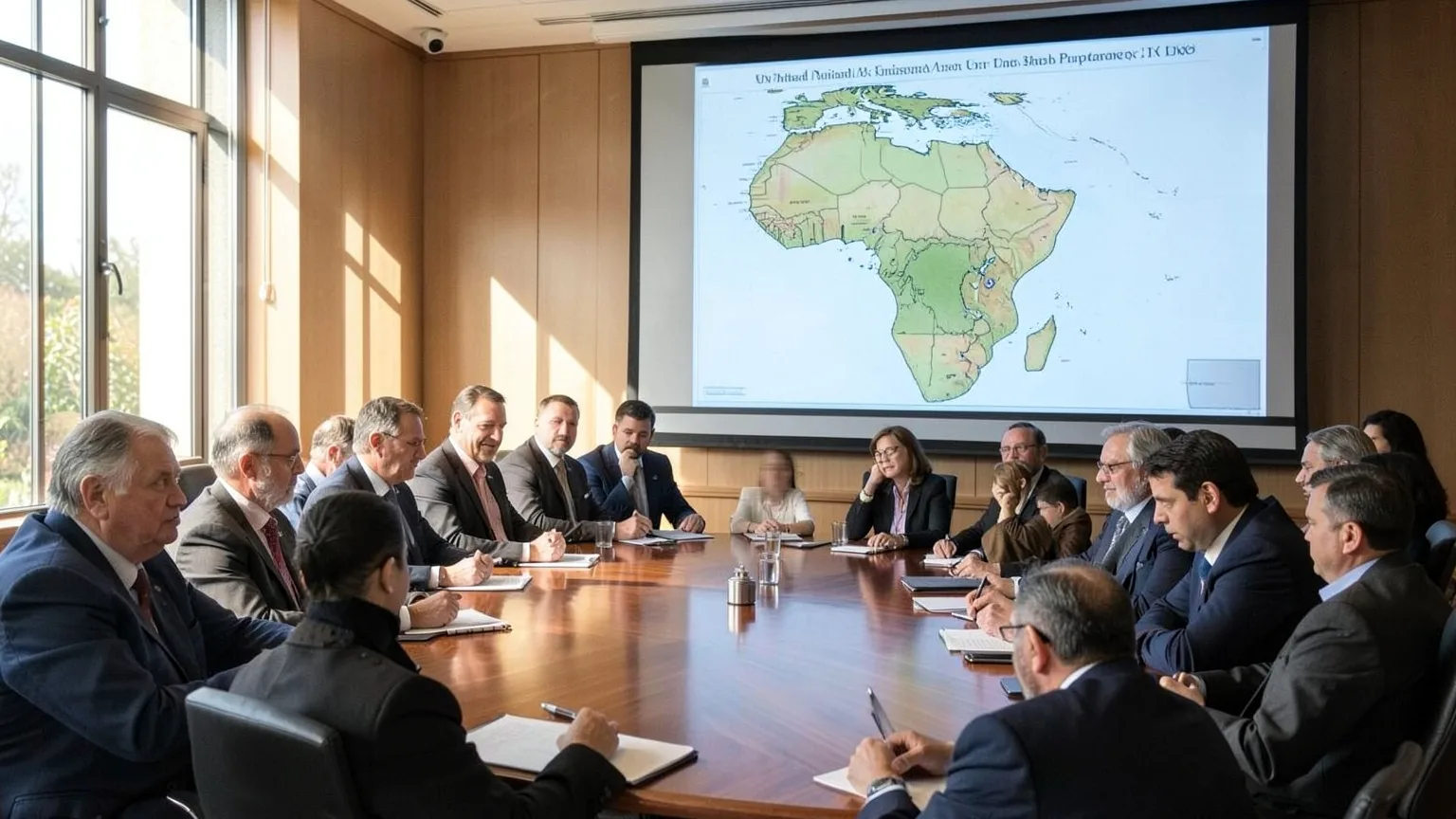
The UN General Assembly voted 164-1, with six abstentions, to endorse the Equal Earth projection in a non-binding resolution led by Togo and the African Union to correct Mercator-era size distortions.
A modern cartographic design from 2018 won near-universal approval at the United Nations; supporters say it repairs distortions that began with a 1569 sea chart that still shapes common maps.
The General Assembly voted 164 in favour, one against and six abstentions to back the Equal Earth projection in a non-binding resolution. Equal Earth preserves relative continental area, so Africa, Latin America, South Asia and Oceania appear larger and more proportionate than on the Mercator layout.
Mercator’s chart inflates high-latitude regions and compresses equatorial ones, which helps explain the persistent myth that Greenland is comparable in size to Africa, even though Africa is about 14 times larger. Togo sponsored the "Correct the Map" resolution for the African Union, and while the vote does not force change, France has already said it will abandon the Mercator projection.
Why the UN adopted the Equal Earth projection
The General Assembly’s vote was driven by a political as well as a technical argument: member states said the familiar world view produced by older projections has real effects on how people learn about and judge countries. That case was pressed most forcefully by African Union members, who argued that maps that shrink equatorial continents over generations help entrench weaker mental impressions of geography, economics and strategic weight.
Campaigners and diplomats pointed to the steady presence of distorted world maps in classrooms, atlases and online defaults as the problem to fix. Supporters described the Equal Earth projection as a more accurate option for representing continental surface areas, and said a projection that preserves relative area gives students and policy makers a truer sense of scale. That argument treats cartography as a form of civic infrastructure: the picture people carry in their heads matters when budgets, development priorities and historical narratives are debated.

Technically, Equal Earth was offered as a compromise between fidelity and familiarity. Designed in 2018 by a team of cartographers, it keeps continental outlines recognisable while correcting the gross area distortions that have long favoured high-latitude landmasses. The effect is deliberate: Africa, Latin America, South Asia and Oceania occupy more realistic visual space without producing an unfamiliar, heavily warped globe.
The political frame was explicit. Sponsors said the move was not merely about maps as tools, but about undoing a visual legacy that can reflect and reinforce old power imbalances. That line of argument resonated across regions and political blocs, helping to convert technical cartographic preference into a broadly supported diplomatic campaign at the UN.
Finally, the vote signalled a preference for an evidence-based update to everyday geography. Delegations argued that, given available alternatives, adopting a projection that better preserves area is a simple, symbolic correction with practical downstream effects for education, publishing and the interfaces people use when they check the weather, read the news or plan travel.
Implementation and next steps for maps and curricula
The UN vote hands the practical work to national authorities, publishers and tech platforms to decide how fast the new look appears in everyday life. Supporters say the immediate pressure'll be on education systems to review textbooks, lesson plans and exam material; the resolution's expected to lead to an update of classroom curriculums, and that's where change'll be most visible to the public.
Publishers and map producers face a straightforward logistics problem: stock, contracts and print runs. Replacing an atlas or a printed wall map usually waits until the next edition, so many schools won't see new maps overnight. Digital mapmakers, by contrast, can roll out changes via software updates, and the outcome'll depend on whether dominant mapping services and device makers choose to set the newer projection as a default or offer it as an option.
Institutions that rely on standardised maps for briefings, statistics and diplomatic materials will make similar choices. International organisations, national ministries and testing authorities will need to set specifications for which projection their documents use. That administrative decision is the practical test of the UN vote: it moves the issue from symbolic to operational when procurement rules, style guides and syllabus authorities adopt a standard.
Teacher training and assessment will be the next hurdle. Even if a ministry orders new maps, teachers must be shown how to explain the change and exam boards must agree which map appears in assessment materials. Those are policy decisions made at the national or subnational level and will vary in timing and ambition.
Watch for two concrete signs of implementation. First, whether education ministries formally amend geography syllabus documents and procurement lists to require the newer projection. Second, whether major textbook publishers or a global digital mapping platform announce a switch in defaults. Those decisions will be the first measurable steps from diplomatic endorsement to maps actually seen in classrooms and on screens.
Originally reported by BBC.


